Ka THAI
/ Brand identity design
/ Logo design
/ Font and color options
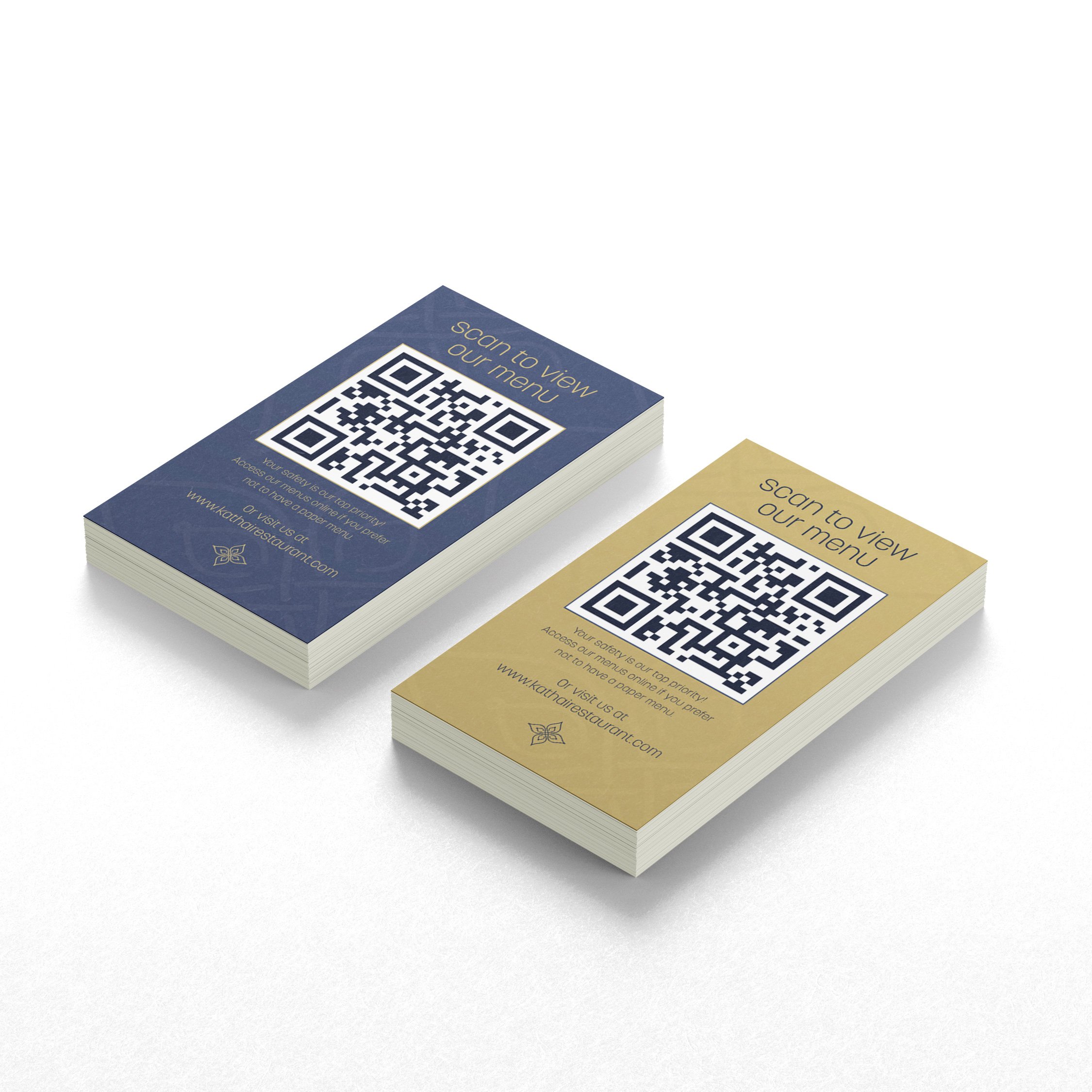
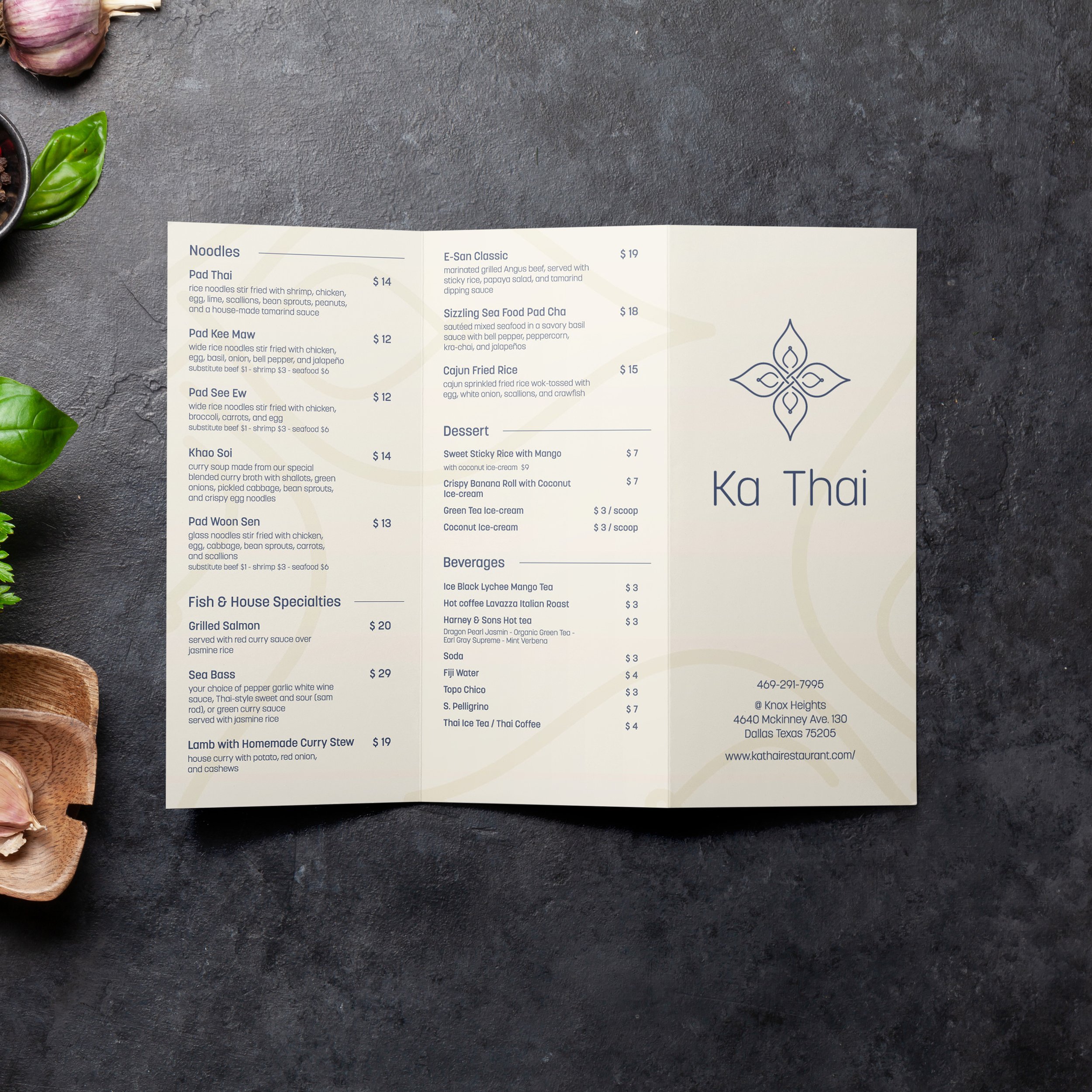
/ Print: take out menu, cocktail menu , QR card
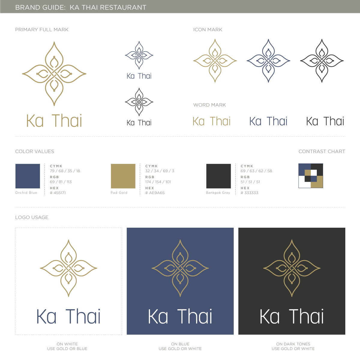
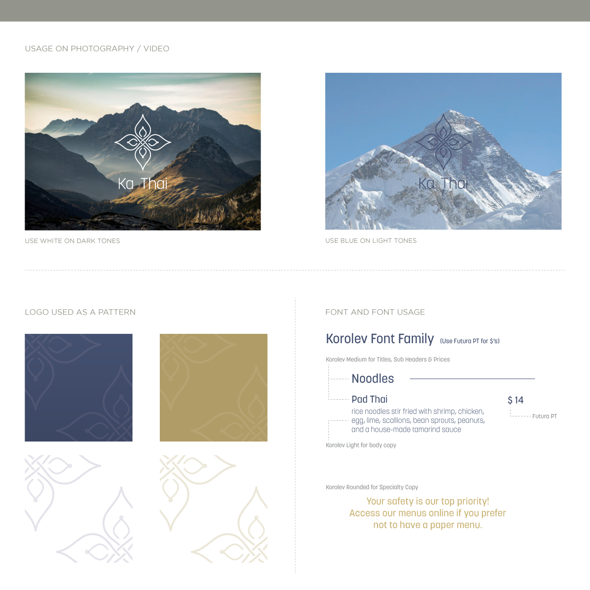
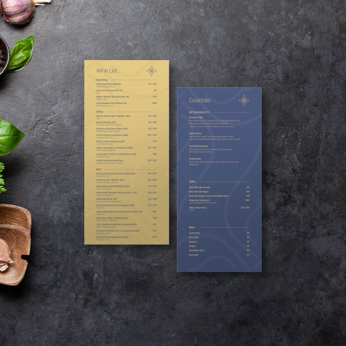
Ka Thai is, in my opinion, the best Thai restaurant in Dallas, so it was an honor to craft a new brand for one of my favorite places to eat*. The client asked for a logo reminiscent of the four petal mark they were using at the time, but didn’t want the logo to look “too Thai”; instead she wanted a very elegant and modern feel.
I intertwined the line of the flower petals into a sinuous, never ending stroke, and tweaked the primary font (Koralev) to match the weight of the flower. We landed on a gold and softened blue color scheme to give a bit of elegance to her menus and print materials.
*Seriously, you should eat there.